Reporter Overview
Under the “Reporter” tab, you’ll find a reporting dashboard that aggregates and displays metrics for all of your past and live campaigns. If you have multiple campaigns associated with your account, you can access a specific campaign’s report from its Campaign Feed.
Impressions, Engagements, Interactions and more
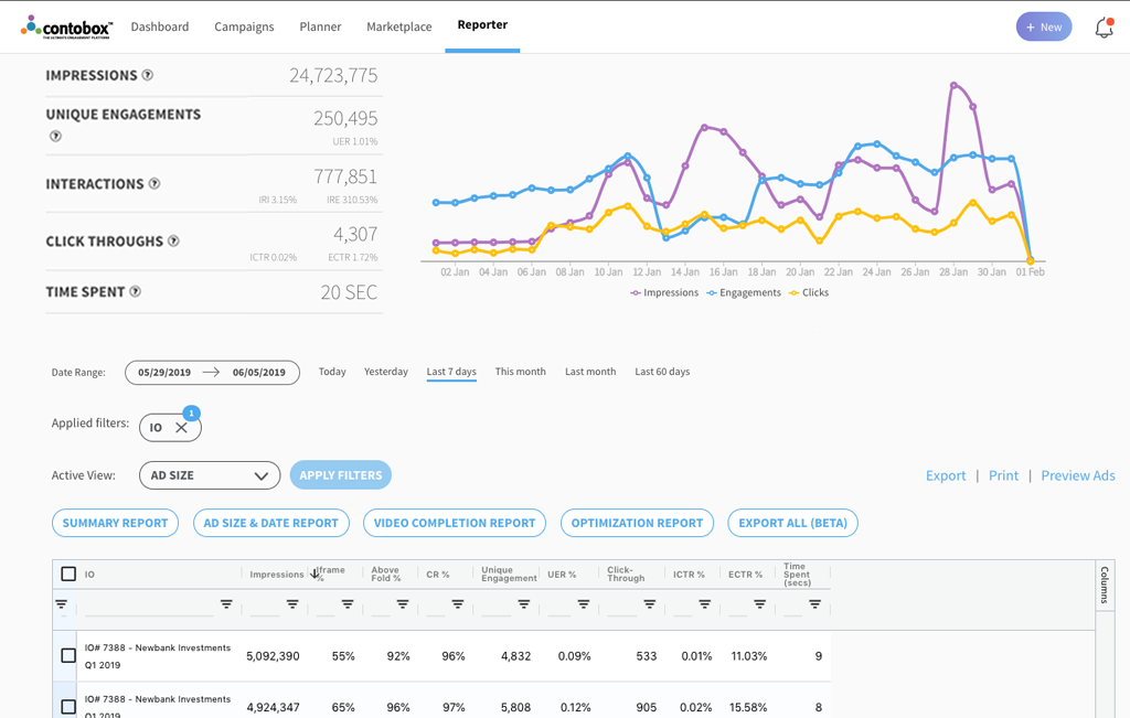
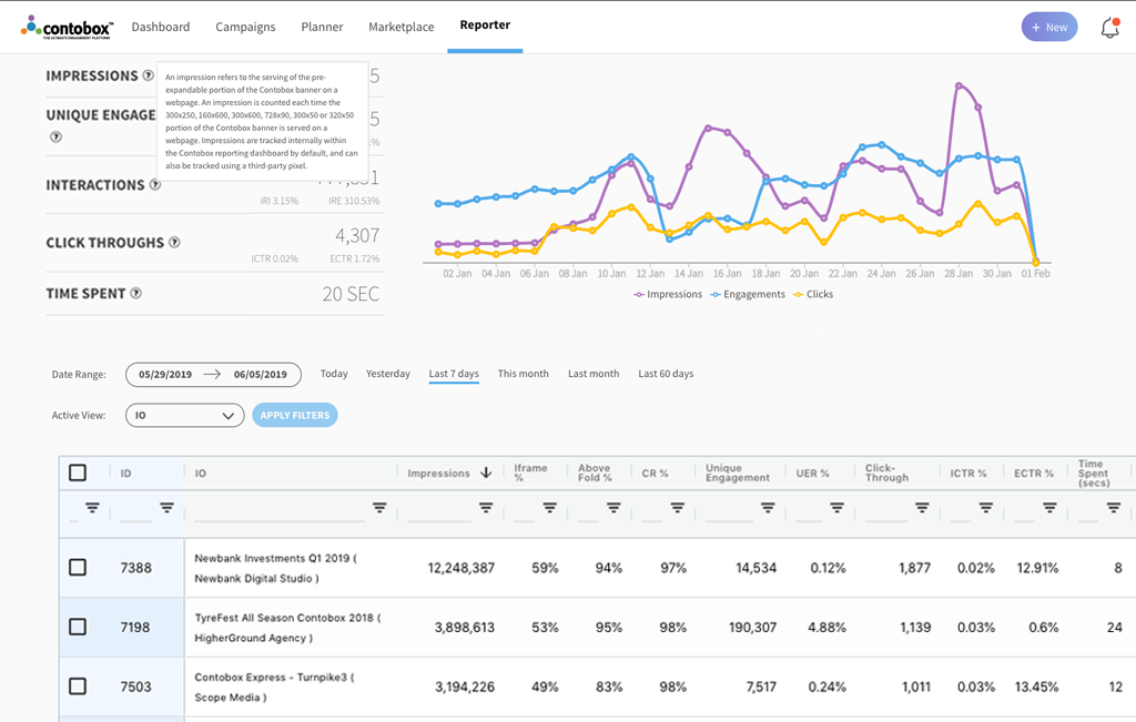
The top section provides a high-level overview of significant campaign metrics like impressions, unique engagements, interactions, click-throughs, percentage rates for each and the average amount of time users have spent with your Contobox units. If any of these terms are unfamiliar, simply click on the question mark to view a short description.
Day-by-Day Metrics
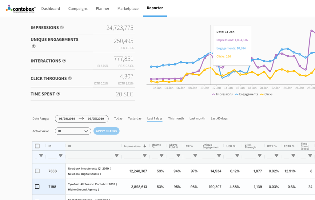
To see the number of impressions, engagements, and clicks your campaign delivered on a particular date, simply move your cursor across the line graph to the right.
Date Ranges
To change the time-frame, click date range, select the dates you want to view and click ‘Apply Filters’. The data above will automatically update based on the dates you’ve selected.
To view the past day, week, month, previous month, or 60 days, you can click on one of these buttons below the line graph and select “Apply Filters.”
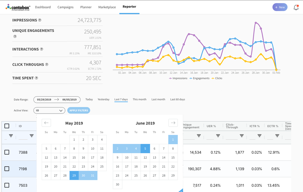
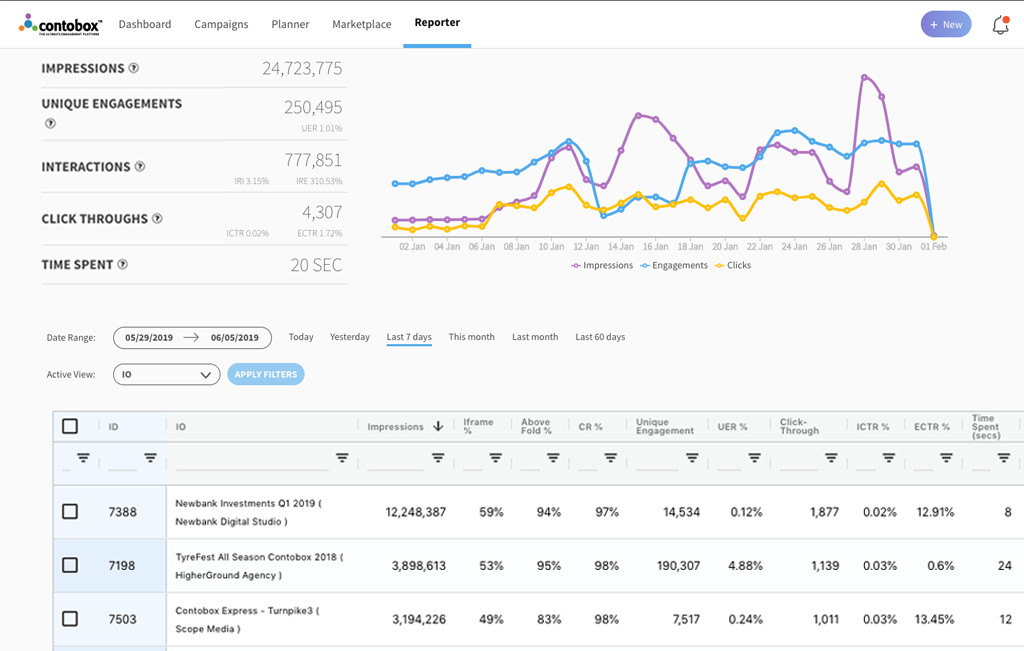
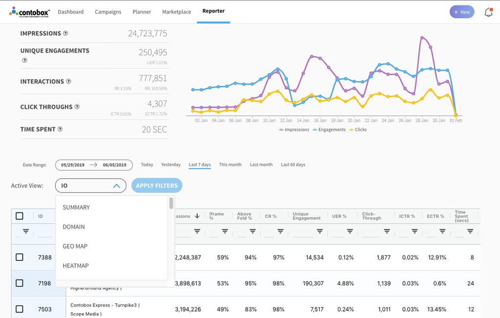
Active Views
There are more than 20 different Active Views available, which allow you to view detailed reporting based on everything from the domains your campaigns are running across to a specific ad formats and sizes you’re using in one or more of your campaigns, to an IO line.
For example, if you want to view metrics based on a single IO, select IO as your Active View.
Search for the specific IO by ID or name, check it off, and click Apply Filters.
You’ll notice the data above adjusts accordingly.
Summary Report
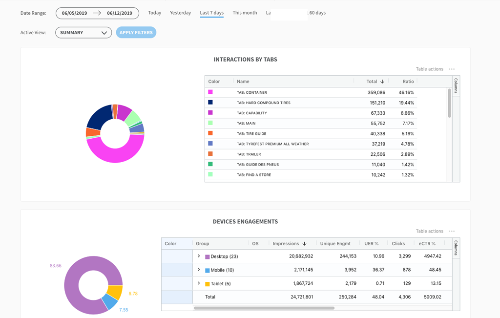
The active view Summary Report you’ll be able view of the audience engagement associated with that IO, including unique engagements, interactions, click-throughs, interactions by tab and device, video completion rate, and a breakdown of engagement by time of day.
Below that you’ll see a breakdown of interactions with your campaigns based on device. The pie chart shows impressions according to desktop, mobile or tablet. If you move over to the table you’ll see a similar breakdown based on other metrics like unique engagements, user engagement rate, and click-through rate.
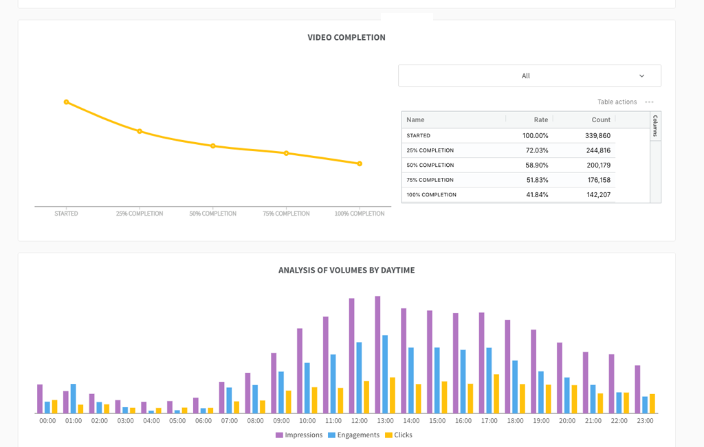
If there’s a video component to any of your campaigns, The Video Completion Report provides a breakdown of the number of people who viewed your video, broken down by ad size.
You can view the number of clicks, engagements, and impressions broken down by hour to see what time of day your campaigns are performing best in the chart below video completions.
The Optimization Report breaks down key engagement metrics according to domain.
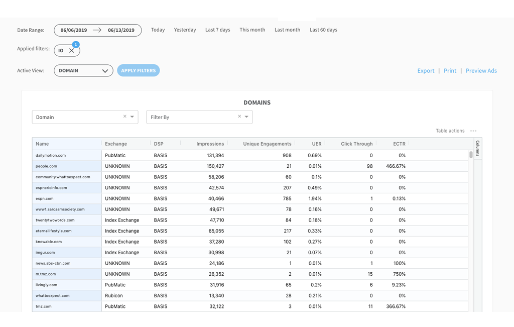
Domains
Domain will give you a list of websites your Contobox units are being served on, providing details on the ad exchange, DSP, Impressions, Unique Engagements and so on. From there, you can filter even further according to specific DSPs.
You can pin columns to the left or right to rearrange your table, use the tool panel to hide certain columns, or rearrange the data in your rows from ascending to descending, all from within the EMP. By clicking on the three dots in the top right-hand corner, you’ll also see the option to export the table as a CSV file.
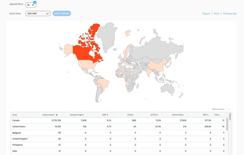
Geo Map
Geo Map provides a map highlighting the location of users exposed to your campaign, so you can see how well your campaign is performing geographically, which will help you determine which regions are most interested in specific products, or your brand in general.
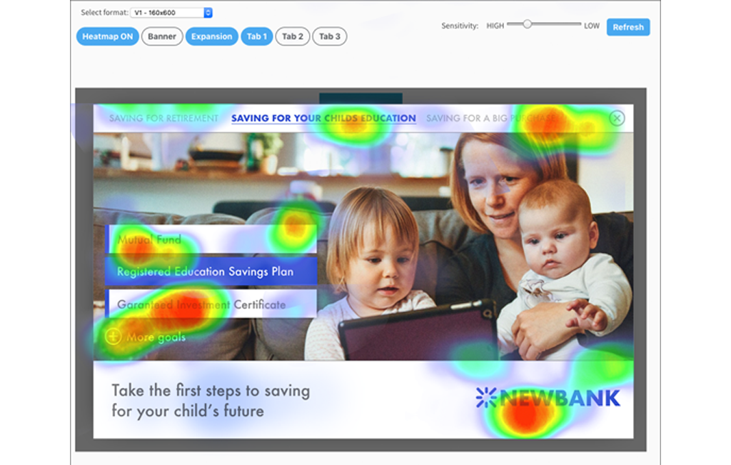
Heat Map
Heat Map will give you a graphical representation of where users were most active within your ad units. If you’ve filtered by IO before selecting Heat Map as your Active View, you’ll be given the option to view the various ad formats and sizes within that IO from a drop-down menu.
Further Active Views
The rest of the Active Views — like line type, ad format, brand, category and currency — provide you with tables similar to what you’ll find under IO, IO lines or ads.
In each of these Active Views, you have the ability to pin or hide columns, search and sort data from ascending to descending. If you select multiple line items from an Active View and apply as a filter, you’ll also be given the option to export the data as a CSV file.
Export Reports
The option to Export or Print data associated with that IO, will appear above the table in the top right-hand corner.
Click “Export” and you’ll be given the option to download four separate excel-based reports: a Summary Report (which will provide all the following reports), or individual Ad Size and Date Report, Video Completion Report, and Optimization Report.